Branding Without a Logo: 5 Ways to Create a Professional Identity
Starting a new business, a community project, or even going freelance is an incredibly exciting time. But it can also feel a bit overwhelming, right? There's a constant pressure to have everything perfect from day one, and a big part of that pressure often revolves around having a professional logo.
Maybe you're not ready for a logo yet. Perhaps the budget isn't there, or you haven't quite pinned down the exact visual you want to represent your hard work. We want to tell you something important: that's completely okay.
A logo is a useful shortcut, but it isn't the be-all and end-all of a professional brand. Your brand is so much more than a single image. It's the feeling people get when they interact with you. It’s the trust you build. It's the consistency they see.
This guide is for you. We're going to walk you through five practical, powerful ways you can build a strong, memorable, and professional identity right now, without needing a logo at all. Let's show you how to build a brand that feels authentic and looks the part.
Table of Contents
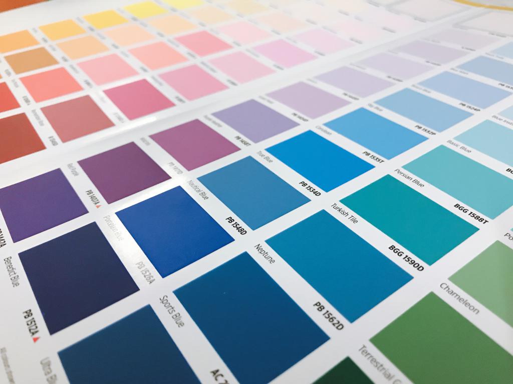
Choose a Consistent Color Palette
What is a Brand Color Palette?
Think of a brand color palette as your business's signature outfit. It's a select group of colors (usually between 2 and 5) that you'll use consistently across everything you do—from your website and emails to your social media posts and invoices. It’s one of the most powerful visual cues you have, long before a logo even enters the picture.
Why Does It Matter So Much?
Colors are a language all on their own. They evoke emotions and create instant associations. A consistent color palette makes your brand instantly recognizable, even from the corner of someone's eye.
-
It Builds Recognition: When people repeatedly see the same colors associated with your name, their brains start to connect the two. Think of the distinct red of the Red Cross or the vibrant red of Target. You know who they are just from the color.
-
It Creates a Mood: Are you a calm, therapeutic service? Soft blues and greens might work well. Are you a high-energy fitness coach? Bright, bold colors could be your go-to. Your palette sets the emotional tone for every interaction.
-
It Screams Professionalism: Consistency shows you care. When your colors are cohesive, it tells your audience that you’re detail-oriented, reliable, and serious about what you do. It removes the chaotic, "making it up as I go along" feel.
How to Choose and Use Your Colors
You don't need to be a graphic designer to do this. Here's a simple, step-by-step approach:
-
Start with a Core Color (Your Primary): Pick one main color that truly represents the feeling of your brand. What’s the primary emotion you want people to feel?
-
Blue: Trust, calm, reliability (great for finance, tech, healthcare).
-
Green: Nature, growth, health, wealth (great for wellness, environmental, financial brands).
-
Yellow/Orange: Optimism, energy, fun (great for creative, youth-focused brands).
-
Red: Passion, urgency, boldness (use with care, but great for grabbing attention).
-
Black/Gray: Sophistication, authority, modernity (great for luxury, tech, professional services).
-
Add a Supporting Color (Your Secondary): This color should complement your primary color. It’s often used for subheadings, accents, or to break up large blocks of the primary color.
-
Choose an Accent Color: This is a contrasting color you'll use sparingly to make things pop. Think "Call to Action" buttons, important highlights, or small details. It should draw the eye.
-
Don't Forget Your Neutrals: You'll need a light neutral (like an off-white or very light gray) for backgrounds and a dark neutral (like a dark gray or charcoal instead of harsh black) for your main text. This makes everything readable.
Helpful (and Free!) Tools:
-
Coolors.co:
This is a great tool. You can lock in a color you like and hit the spacebar to generate palettes that work with it. It's fun and incredibly helpful.
-
Adobe Color:
A more advanced but equally powerful tool for exploring color harmonies and trends.
-
Canva's Color Palette Generator:
You can even upload a photo you love, and it will pull a palette from the image for you.
Once you have your palette, write down the specific color codes (known as HEX codes, like #333333). Keep them handy and use them everywhere.
Select a Signature Font Pairing
What is a Font Pairing?
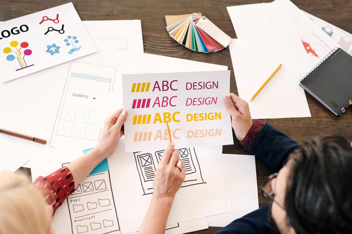
Just like your colors, the fonts (or typefaces) you use say a lot about your brand's personality. A font pairing is simply a combination of two, or at most three, fonts that you'll use consistently. Typically, you'll have one for headlines (your "display" font) and one for your main body text (your "paragraph" font).
Why is Typography so Important?
If colors create the mood, typography delivers the message. The right fonts can make your text a pleasure to read, while the wrong ones can be jarring and unprofessional.
-
It Conveys Personality: A traditional, formal font like Times New Roman feels very different to a clean, modern one like Montserrat. Your font choice instantly tells people if you're classic and established, or fresh and innovative.
-
It Improves Readability: The most important job of your text is to be read! A good font pairing ensures your headings stand out and your paragraphs are easy on the eye, which means people will actually absorb what you're saying.
-
It Reinforces Your Brand: When your website, your quotes, and your emails all use the same consistent fonts, it creates a seamless and unified brand experience. It’s another layer of that all-important professionalism.
How to Choose Your Fonts
The world of fonts can feel endless, but you can simplify it by focusing on a few key ideas.
-
Understand the Two Main Families:
-
Serif Fonts: These have little "feet" on the letters (like Garamond, Georgia). They often feel traditional, classic, trustworthy, and are very easy to read in print.
-
Sans-Serif Fonts: These don't have the little feet (like Arial, Helvetica, Lato). They feel modern, clean, and minimalist, and are fantastic for on-screen reading.
-
Find a Good Pair: A classic rule of thumb is to pair a serif font with a sans-serif font. For example:
-
Headline: A bold, clean Sans-Serif font (like Oswald or Montserrat).
-
Body Text: A classic, readable Serif font (like Merriweather or Lora).
-
This contrast creates a clear visual hierarchy and looks very professional. Alternatively, you can use two different sans-serif fonts, but make sure they are distinct enough (e.g., a very bold, condensed one for headlines and a lighter, wider one for text).
-
Prioritize Readability Above All Else: For your main body text, choose a font that is designed for it. Avoid overly decorative, handwritten, or complex fonts for anything more than a few words. Your message is what matters most.
Helpful (and Free!) Tools:
-
Google Fonts:
This is the ultimate resource. It’s a huge library of high-quality, free-to-use fonts. You can type in your own text to preview them, and it even suggests popular pairings.
-
Fontjoy:
This tool uses AI to help you generate font pairings. It's a great way to discover combinations you might not have thought of.
Once you've chosen your pairing (e.g., "Headings: Montserrat Bold, Body: Lora Regular"), write it down with your color codes. You're building your very own brand style guide!
Define Your Unique Brand Voice
What is a Brand Voice?
So far we've focused on visuals. Now, let's talk about personality. Your brand voice is how your brand sounds. It's the language you use, the personality you express, and the tone you take in all your communications. It's not just what you say, but how you say it.
Are you witty and informal? Or are you reassuring and formal? Are you straight-to-the-point and technical, or are you warm and narrative?
Why Does Your Voice Matter?
Your voice is how you connect with your audience on a human level. In a world full of faceless companies, a distinct voice builds relationships and trust far more effectively than any graphic.
-
It Builds Connection: People buy from people they like and trust. A consistent voice makes your brand feel like a person, not a corporation. It makes you relatable.
-
It Attracts the Right People: Your voice acts like a filter. A fun, informal voice will attract customers who appreciate that approach, while a more formal, authoritative voice will attract an audience seeking that kind of expertise.
-
It Creates Consistency: When every email, social media post, and website page sounds like it's coming from the same place, your brand feels stable and reliable. This is crucial for building long-term trust.
How to Find and Define Your Voice
This isn't about creating a fake personality. It's about bottling the essence of your brand and how you want your customers to feel. Let's walk through it.
1. Imagine Your Brand as a PersonIf your business walked into a room, what would its personality be? The easiest way to start is by brainstorming a few adjectives. Aim for three or four that feel just right. Are you Helpful, Clear, and Empathetic? Or perhaps you're more Bold, Witty, and Direct? Maybe you're Professional, Reassuring, and Knowledgeable. Write these core words down.
2. Add Depth with a "This, Not That" MindsetTo really refine your voice, it's helpful to define not just what you are, but also what you are not. This simple exercise prevents you from straying into the wrong tone. For example:
-
We are Helpful, but not Patronizing.
-
We are Conversational, but not Sloppy.
-
We are Experts, but not full of Jargon or Clinical.
-
We are Positive, but not Unrealistic.This creates clear boundaries and makes your voice much easier to maintain.
3. Write Your Voice GuidelineNow, bring it all together into a short, simple paragraph you can refer back to. This becomes your north star for all your writing. For example:
"Our voice is warm, understanding, and always helpful. We use clear, simple English and avoid technical jargon. We want our customers to feel seen and supported, so we speak to them like a knowledgeable and trusted friend."
Keep this description with your color and font choices. Before you write anything—an email, a quote, a social media caption—reading it over will help you stay consistent and true to the brand you're building.
Curate a Cohesive Imagery Style
What is a Cohesive Imagery Style?
Your imagery style is the common thread that ties all your visuals together. It's the overall look and feel of the photographs or graphics you use. Even without a logo, a consistent visual style can make your brand instantly recognizable and look incredibly polished.
It’s about deciding on a "vibe" and sticking to it. Are your photos bright, airy, and full of natural light? Or are they dark, moody, and atmospheric? Are they vibrant and full of color, or minimalist with a lot of white space?
Why Does a Consistent Style Matter?
In a visual world (think Instagram, Facebook, and your own website), your images are often the first thing people notice.
-
It Creates a Strong First Impression: A messy, inconsistent collection of images can look amateurish. A cohesive set of images, however, looks deliberate, professional, and high-quality.
-
It Communicates Your Brand's Mood: Just like colors, the style of your photos sets a tone. Bright, happy photos of people create a different feeling than sleek, architectural shots of empty spaces. Your imagery should match the emotion you want to convey.
-
It Makes Your Content Recognizable: When someone is scrolling through a busy social media feed, a consistent imagery style can make them stop. They'll start to recognize your posts before they even see your name, purely based on the visual "feel."
How to Create Your Imagery Style
-
Choose Your Vibe: Look back at your brand voice adjectives. Do they suggest a visual style? "Bold and Witty" might lead to high-contrast, colorful photos. "Calm and Reassuring" might lead to soft, naturally lit, and serene images.
-
Decide on Your Subject Matter: What will you actually show?
-
People-focused: Candid shots of you, your team, or your customers (with permission!). This builds a huge amount of trust and personality.
-
Product-focused: Clean, well-lit shots of what you sell or the tools of your trade.
-
Abstract/Atmospheric: Textures, landscapes, or details that evoke the feeling of your brand.
-
Stick to a Consistent Editing Style: This is the secret sauce. Whether you take your own photos or use stock imagery, try to edit them in a similar way.
-
Use a Preset: Mobile apps like VSCO or Adobe Lightroom Mobile have "presets" (filters) you can apply. Find one you like and use it on all your photos to give them a similar color tone and feel.
-
Keep it Simple: You could simply decide to always slightly increase the brightness and warmth on every photo, or always convert them to black and white. The key is doing the same thing every time.
Helpful (and Free!) Stock Photo Sites:
Top Tip: When using stock photos, try to choose images from the same photographer or collection where possible. This is an easy shortcut to a cohesive look.
Master the Professional Customer Experience
What is the Customer Experience?
Your brand isn't just what people see; it's what they feel. The customer experience is the sum of every single interaction someone has with your business, from the first time they land on your website to the way you sign off an email. This is your brand in action, and it's arguably the most important element of all.
Why is This Part of Your Brand Identity?
A slick website is meaningless if a customer's email is ignored or their phone call is handled unprofessionally. A positive, consistent, and professional experience builds the most powerful brand asset of all: reputation.
-
It Builds Unshakeable Trust: When customers know they can rely on you to be polite, prompt, and professional every single time, they will trust you with their business and their recommendations. This is more powerful than any logo.
-
It Differentiates You: Two businesses can sell the exact same thing, but the one that makes its customers feel valued and respected will always win. A great experience is a huge competitive advantage.
-
It Creates Brand Advocates: People who have a great experience don't just come back; they tell their friends. They become your voluntary marketing team.
How to Master the Professional Experience
This is about sweating the small stuff. Here’s a checklist of 'touchpoints' to professionalize:
-
Your Email Signature: This is a huge, often-missed opportunity. Create a clean, professional email signature that includes:
-
Your Name
-
Your Business Name (even if it's just your own name)
-
Your Role (e.g., 'Founder', 'Photographer', 'Consultant')
-
Your Phone Number and/or Website
-
How to do it: Use your brand fonts and a touch of your brand color if you can. Most email providers have a built-in signature editor.
-
Your Invoices and Quotes: Don't send a plain text email asking for money. Use a simple, clean template for invoices and quotes. Tools like Canva, or even Word and Google Docs, have free, professional-looking templates. Add your name, contact details, and use your brand colors and fonts.
-
Your Voicemail Message: If you have a business number, ensure your voicemail message is clear, professional, and friendly. State your name and business, and let them know when you'll get back to them.
-
Response Times: Set a realistic goal for responding to emails and messages (e.g., "within 24 hours") and stick to it. Reliability is a cornerstone of professionalism.
-
On-Site and In-Person Interactions: How do you or your team present yourselves when meeting clients or working on-site? A neat appearance and a friendly, helpful manner are part of your brand. Making it clear who is part of your team and who is a visitor is a simple but vital part of on-site professionalism and safety.
By standardizing these small but crucial details, you create a seamless experience that feels secure, reliable, and exceptionally professional, all without a logo in sight.
Putting It All Together: From Digital to Physical Professionalism
You’ve done the work. You have your consistent colors and fonts, a clear voice, and a cohesive style for your images. You've thought about every digital touchpoint, from your email signature to your invoices. You’ve successfully built a professional identity that creates trust and recognition.
But branding doesn't stop at the screen.
That same level of professionalism needs to translate into the real world, especially for businesses with employees who work on-site, visit clients, or operate in shared spaces. When a member of your team arrives, how do you instantly convey that they are a legitimate, professional part of your organization? How do you maintain security and provide peace of mind for your clients and for your own team?
One of the simplest and most effective ways is to use ID cards to clearly identify who is authorized to be on-site. Even without a logo, a well-designed ID card using your brand colors, fonts, and a clear photograph instantly extends that professional identity you've worked so hard to build. It’s that final, tangible piece of the puzzle that brings all your hard work together, showing clients and colleagues at a glance that you are a secure, reliable, and professional organization.
Learn more about our professional Employee ID Cards
© 2024 The Card Project US LLC
reg: 99-3537629
|


